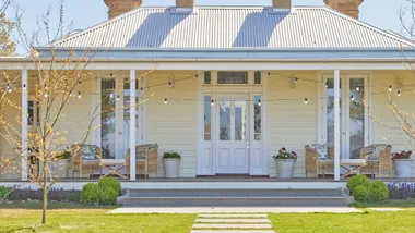
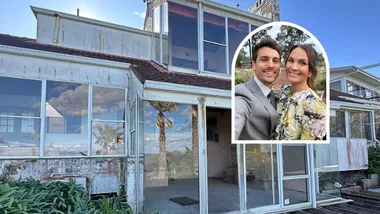
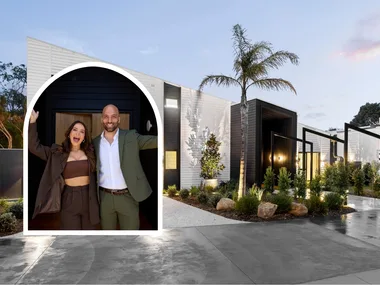
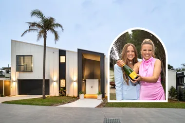
In a complete overhaul of Tim’s 1950s weatherboard cottage in Victoria, House Rules teams produce a sleek, contemporary home that receives mixed results on the scoreboard from the judges.
Whilst most teams were happy with the results of their efforts in Tim’s home, the renovation this week disappointed the judges, generally due to the House Rules seemingly being ignored in favour of black, black, black in finishes and a lack of thoughtful design overall.
Tim & Mat’s House Rules:
1. Fuse industrial with sleek
2. Choose timber, terrazzo & steel
3. Be cool with blue & green
4. Add warmth with furnishings
5. Bring Melbourne style with a graphic edge
Mikaela & Eliza: Master bedroom, laundry
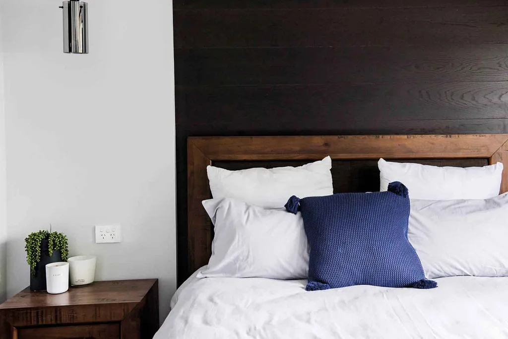
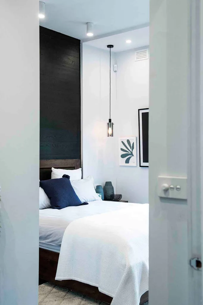
The dramatic black timber feature bedhead created by Mikaela & Eliza was a hit with all three judges – Wendy loved the graphic artwork and Jamie was impressed with the interior architecture behind the construction. Unfortunately, that’s where the compliments ended – too much lighting and “untidy” furnishings had the judges feeling they needed to put more effort into their styling.
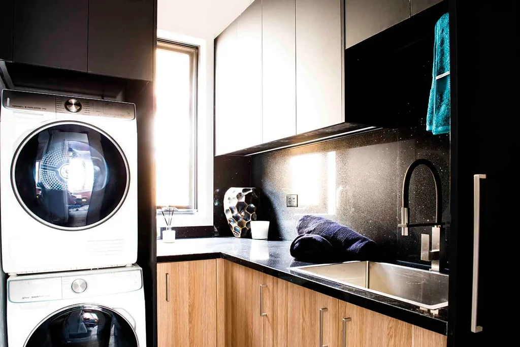
In the laundry, the judges were underwhelmed and disappointed with no attention to the House Rules in terms of colour palette. The black-on-black cabinetry and benchtops though sleek, left them cold.
Mikaela & Eliza received a total score of 15/30 for their zone.
Shayn & Carly: Mud room, dining room, bathroom
Despite Shayn’s back injury suffered early in the week, he and Carly finished on top of the ladder with the judges super impressed with their entire zone – most notably the dining room design.
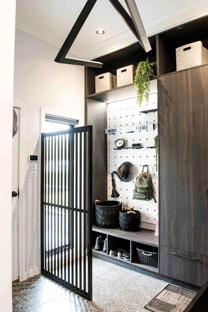
In the mudroom whilst the dividing screen was a miss, their design choices were generally admired by the judges, in particular, the combination of terrazzo flooring with the dark cabinetry – hitting the House Rules bang on. LLB was impressed, saying, “I love the fact that these guys are now, in this competition trying to squeeze too much design into a small space.”
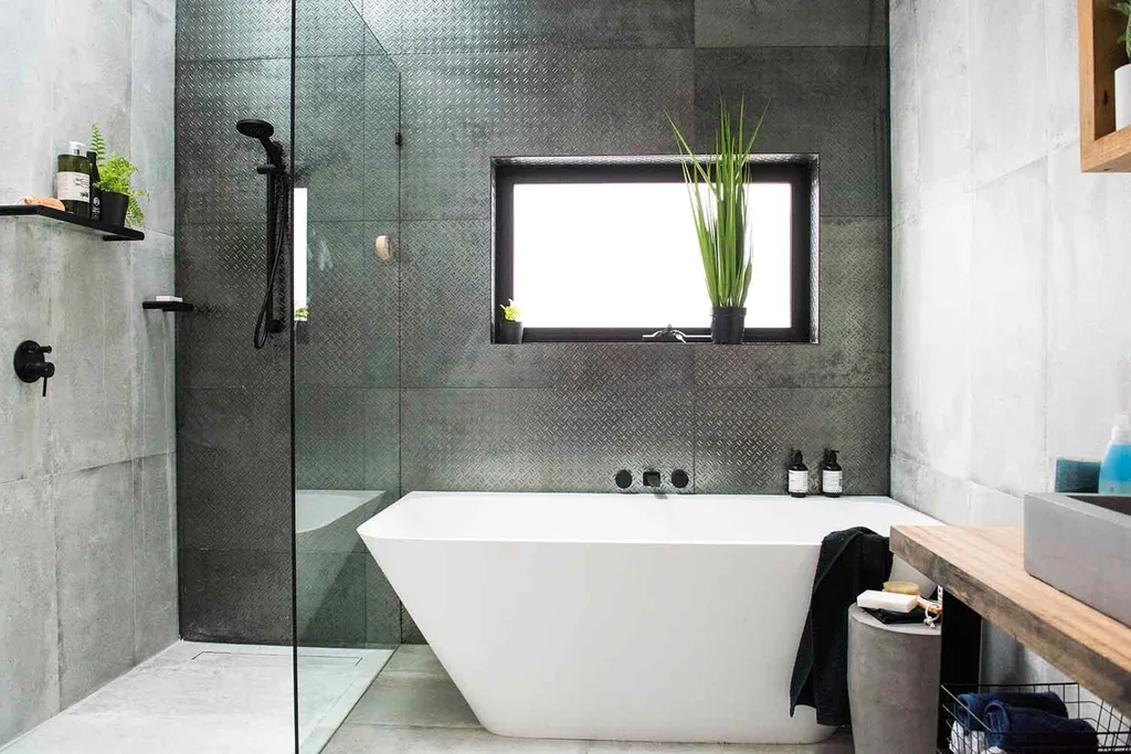
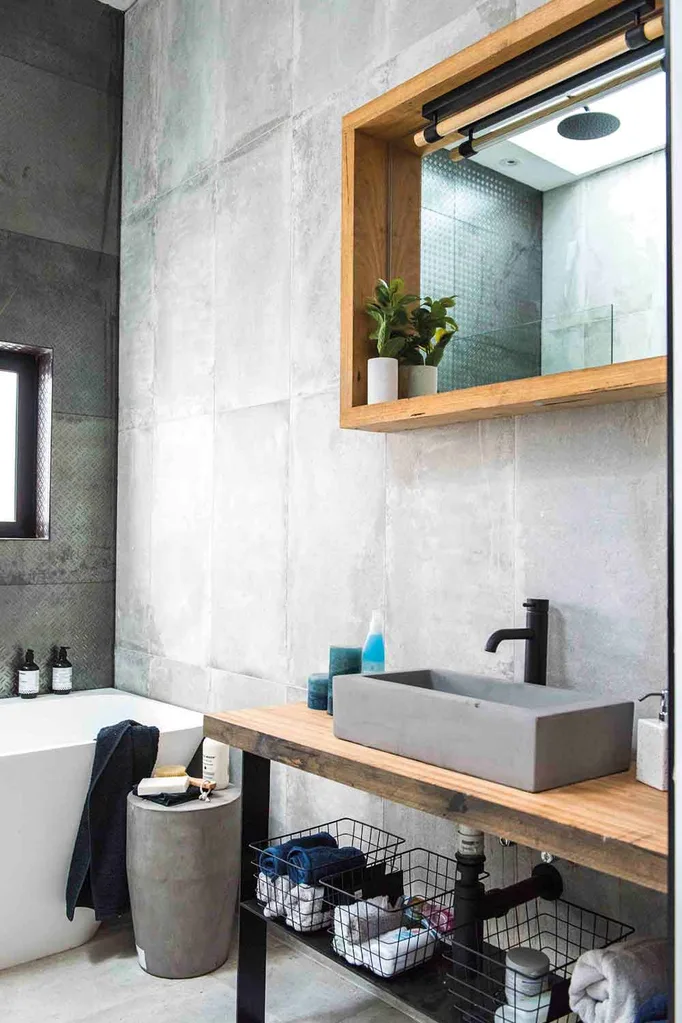
In the bathroom, Shayn & Carly’s choice of floor-to-ceiling concrete tiles and the stunning over-sized tiles made the area visually “too hard” generally, but the geometry of the oversized shower placed high in the skylight was welcomed as a brilliant design decision.
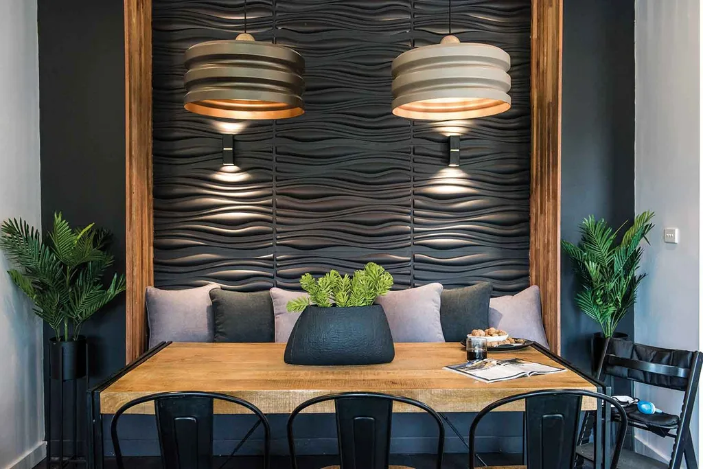
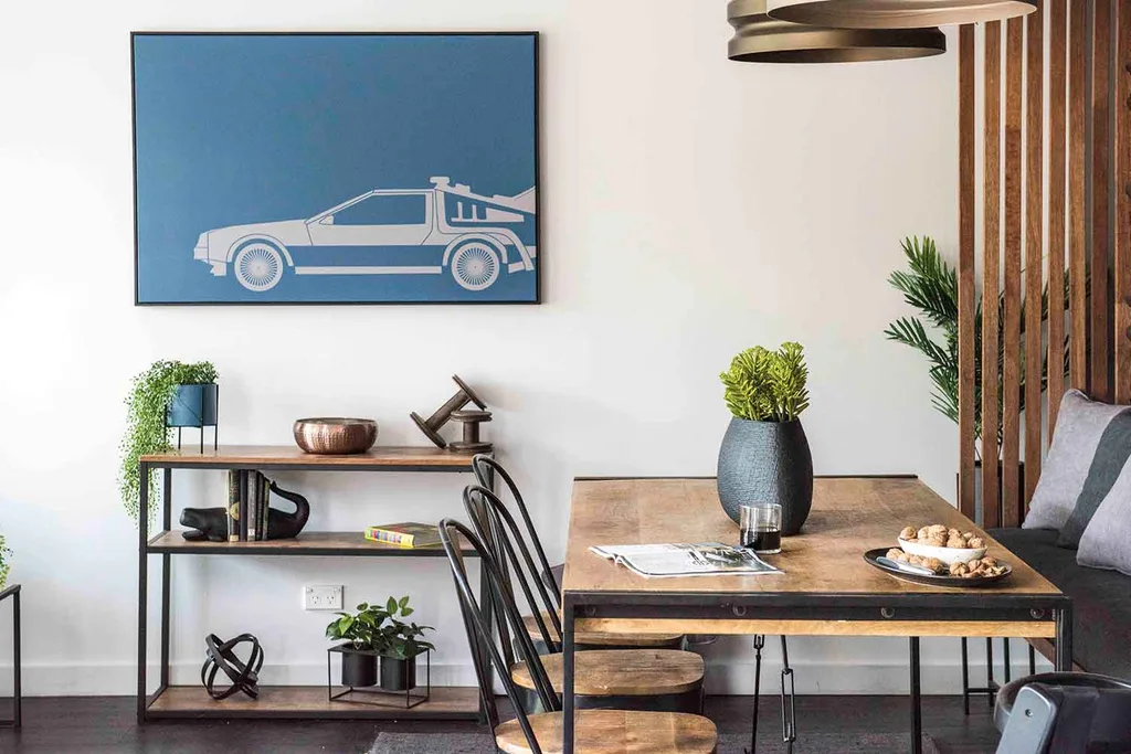
The dining room was the biggest success of their zone – LLB felt Shayn & Carly nailed their finishes, light fittings and the layout of the space – orientating the seating to “steal the view” through the living room to the borrowed landscape of the backyard.
The judges are excited by Shayn & Carly’s fearlessness with their design and Wendy said, “I think it’s very very close to being perfectly executed.” They scored a total of 26/30 including a 9 from both Wendy and Jamie. LLB said they’ve become contenders in the competition to watch.
Pete & Courtney: Isabella’s room and kitchen
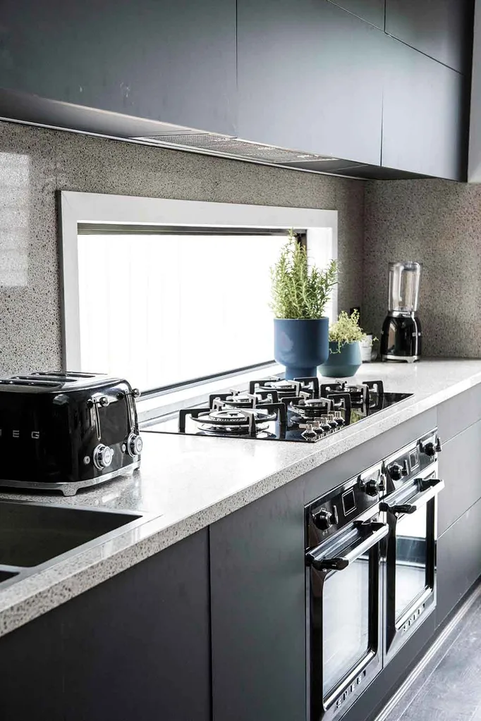
Getting busy to take risks with their design in the sleek industrial kitchen, Pete & Courtney chose terrazzo for benchtops and splashback in a nod to the House Rules, which impressed the judges. the generous island bench was “Definitely beautiful and the hero of this kitchen,” according to Wendy.
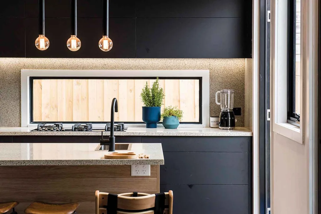
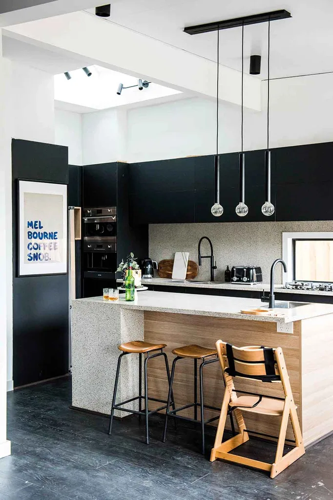
Gadgetry in automatically opening cupboards and plenty of natural light through the ceiling and window behind the sink was well received, with Wendy saying, “I think this is a kitchen to be proud of.”
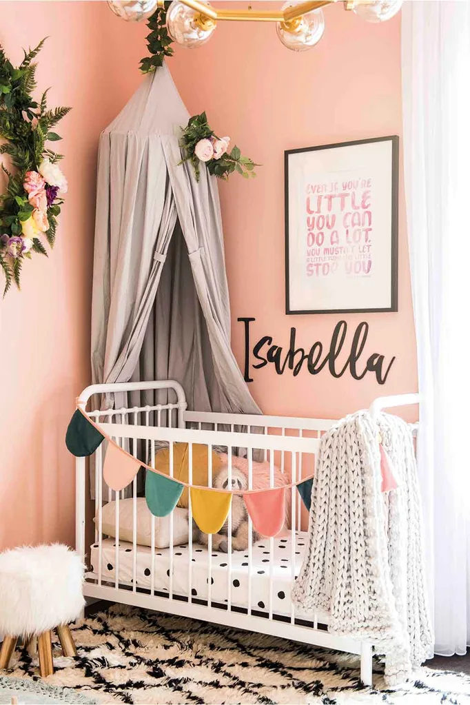
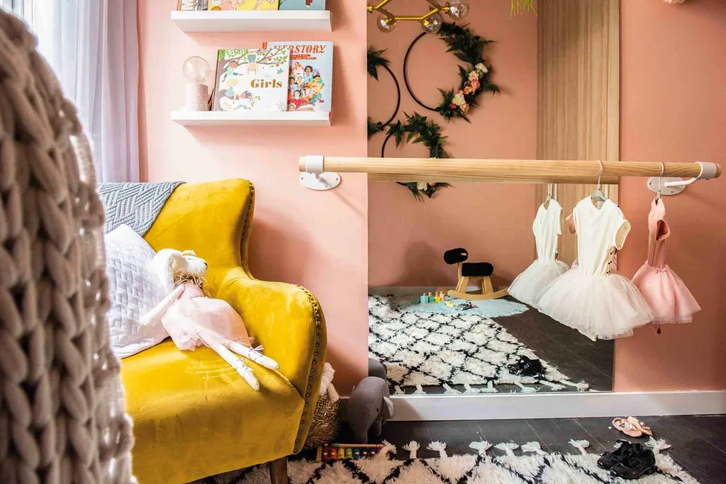
Isabella’s room
Pete & Courtney took a risk and ignored the House Rules in baby Isabella’s room – feeling sleek industrial style wasn’t appropriate for a little girl’s bedroom. The judges agreed, admiring the touches of terrazzo, peachy-pink walls and brass accents which, according to LLB made for, “An incredibly grown-up design scheme that’s been made relevant for Isabella”.
Pete & Courtney scored 23/30 from the judges.
Katie & Alex: Entry, hallway and lounge room
Happy with their zone and riding high on the leaderboard, this week Katie & Alex took a fall from the judges in their scoring, with them being disappointed in the lack of colour – as directed by the House Rule of “Be cool with blue and green”.
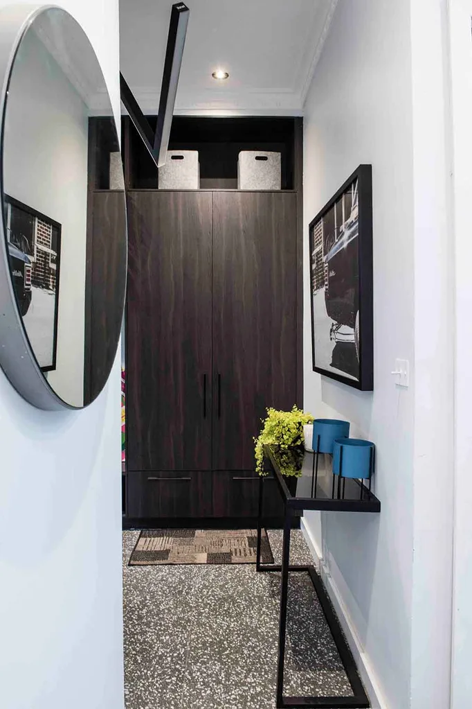
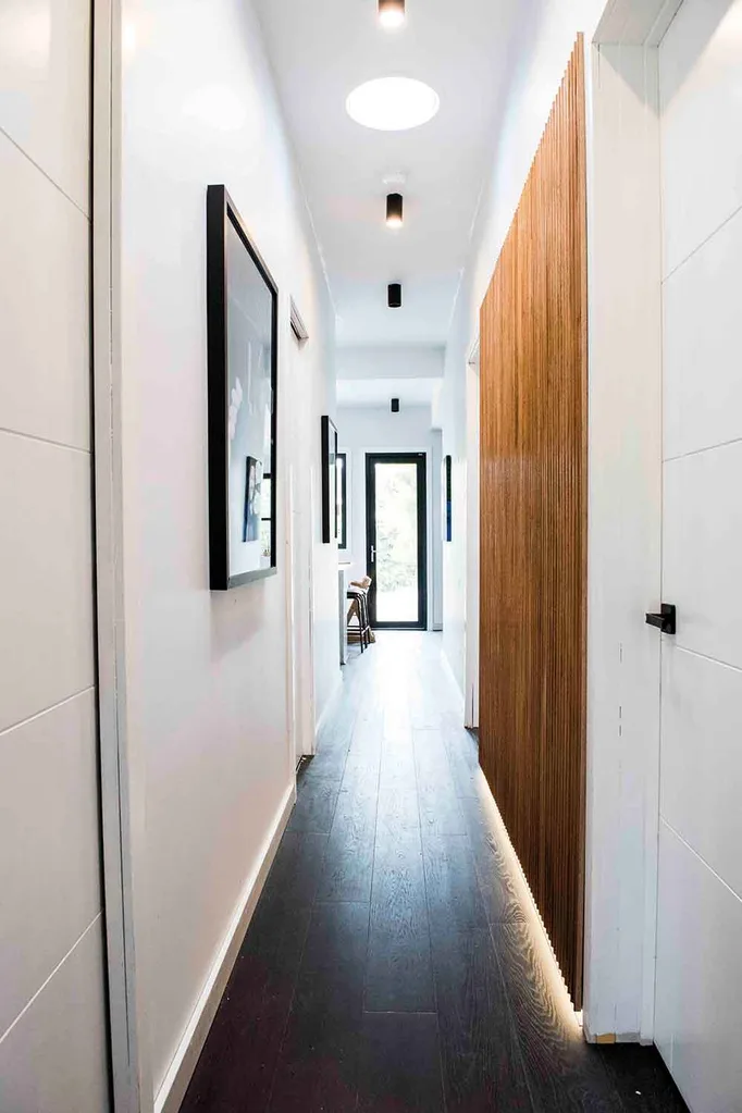
The entrance was “underdesigned” too white and too cramped according to the judges but the hallway made more of an impression, with the handmade timber screen along the wall admired by Jamie and Wendy, whilst LLB would have like to see more of it.
Lounge room
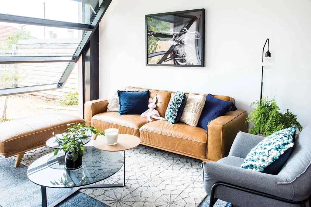
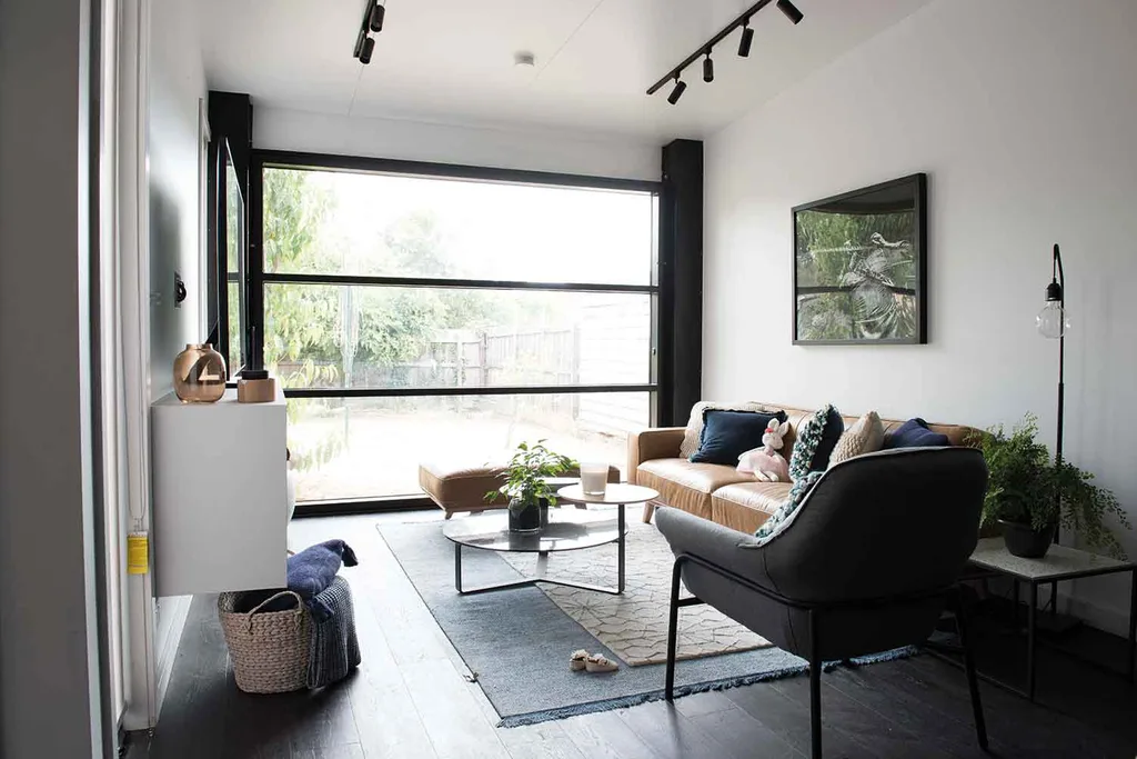
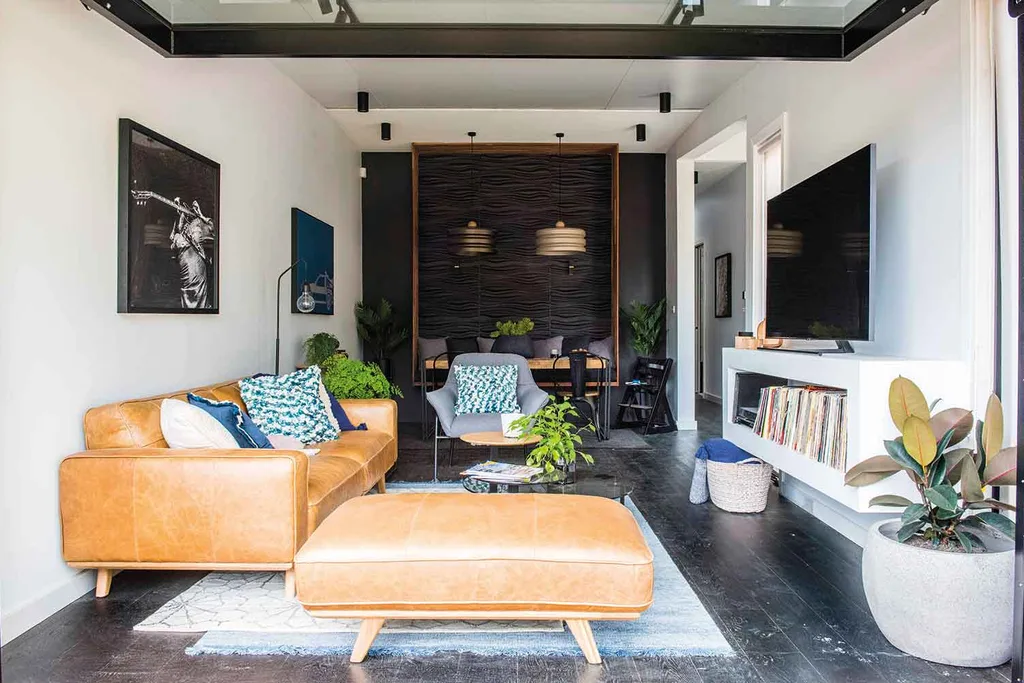
In the lounge room, the massive tilt door to the backyard hit the “industrial sleek” note was bang on for Jamie and Wendy loved the custom shelf for Tim’s record collection. The judges would have liked to see colour on the walls and a stronger sense of Melbourne graphics, as directed by the House Rules. On the whole, the judges were disappointed in Katie & Alex’s zone and felt they were slipping – it was reflected in scores of 3/10 from LLB and 14/30 in total from the judges.
Lisa & Andy: Ensuite, walk-in wardrobe & den
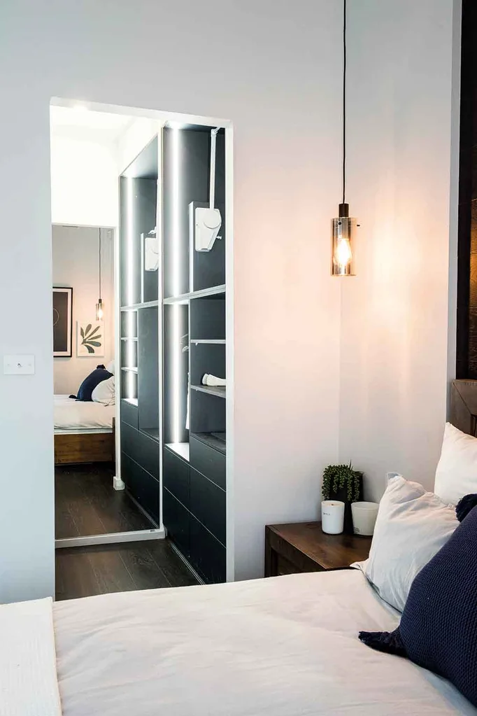
In the walk-in wardrobe, the function of the space impressed but the choice of black for the cabinetry without including blue and green disappointed the judges.
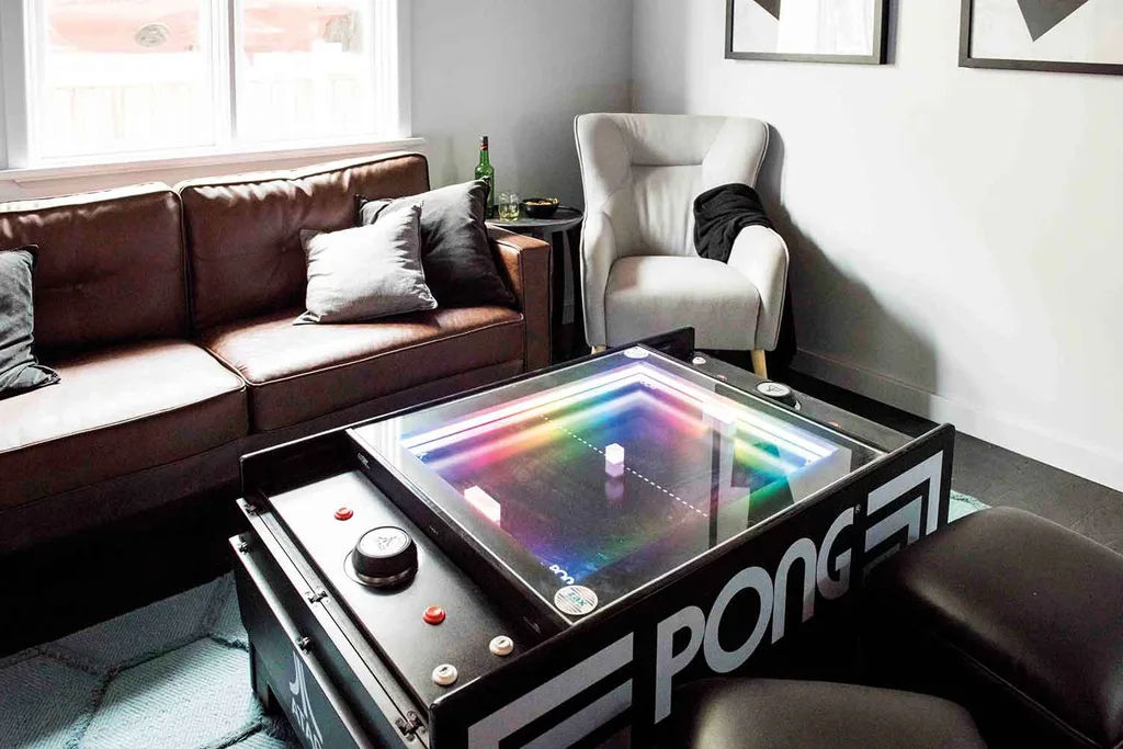
Looking to move further up the leaderboard and winning the early room reveal in the eyes of Tim & Mat with their den design, Lisa & Andy also impressed the judges with the timber-lined ceiling and statement lighting, though the scale of TV and furnishings were a little off.

Ensuite
The blue hex tiles on the floor and up the wall hit the right notes with Jamie and the use of terrazzo, whilst answering the House Rules was a little too much for LLB. Wendy liked the timber vanity and the general layout of the bathroom.
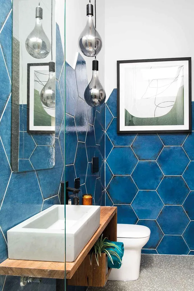
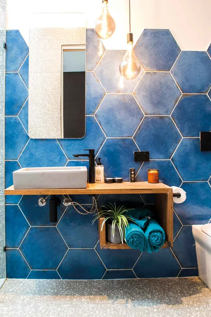
Jamie felt Lisa & Andy’s zone was “lacklusture” and Wendy liked their design concepts but not the execution. LLB felt this team need to lift their game and scored them a 3. In total Lisa & Andy scored a total of 16/30 from the judges.
You might also like:
3 things you need to know about hanging art
House Rules reveal: Mikaela & Eliza’s stunning coastal dream home
Catch the latest episode of our new Style Rules podcast, where HB editor Sarah Burman and style editor Fiona Michelon talk all things House Rules, chat to chippie brothers Tim & Mat and get a behind-the-scenes view with judge Wendy Moore.
