With limitless inspiration at myriad price points, it’s never been easier to make your bathroom look as beautiful as it is functional. Whether you’re upgrading to sell or enjoy, for family functionality or deluxe indulgence, the first step to translating the look you love into a practical solution is to firm up your tiling palette – the foundation of the room’s scheme.
There is plenty of advice out there on bathroom design, and there’s no doubt that this small space requires big decisions. There are those who want their bathroom design to go all out with bright colour and va-va-voom. Others prefer a simple look, think spa-like tranquility. Read on for the need-to-know of tile shopping, with plenty of bathroom tile design ideas.
Planning points
Budgeting is key. Factor in the supply cost of tiles, and the labour. “Anything above a standard ‘bond’ lay of 300mm x 600mm tiles adds to the laying costs,” explains Vanessa Cook of Smarter Bathrooms. Small tiles in sheets can be time consuming to lay, while large formats may need two tilers on site due to their weight. Extra-large tiles are on trend, but are especially tricky as they need flat walls and floors – and if you are revamping an old house you may need to resurface your room, adding to the cost.
Budget tiles can look amazing arranged in an unusual way, but be warned: “Laying a herringbone or a chevron pattern is complex, as the pattern must line up,” says Vanessa, who advises checking with a tiler if a pattern lay is feasible with your chosen tile before ordering. Balancing higher labour cost areas with a simple tile and lay in non-feature spaces can help. How you lay bathroom tiles has a big impact on the overall look, so do your research and decide what look you’re going for.
Feature tiles help direct attention towards the prettier parts of the room, so put them to work behind a hero item – not the loo! – and keep the remaining walls simple. undefined
Perfect placement
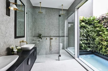
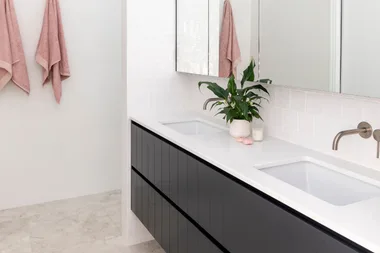
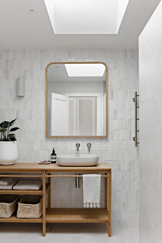
A uniform scheme of the same tile on floor and walls will help visually enlarge a small space, with grout lines matched to flow flawlessly between the surfaces. Conversely, a contrasting floor tile helps define the room. “Subtle variation within a floor tile will be more forgiving than a solid colour, which can appear flat and a little dated,” suggests interior designer Naomi Nimmo of Nimmo Nielsen Collective. “Where budget permits, feature tiles work best on a decent scale such as an entire wall, not just a small niche,” adds Naomi. Running an attractive floor tile up one wall is another option, and this creates the illusion of a longer room, while contrasting grout can help make a feature of a plain tile. However, make sure the grout is sealed to help prevent it discolouring in patches.
“Gone are the days of selecting dark grout on the floor to avoid unseemly staining – you can now use lighter grout colours, which will not change over time.” Vanessa Cook
Nailing your bathroom tile design look
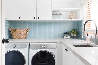
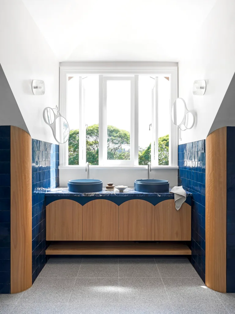
With so many tiles available in all shapes, sizes, styles and textures, pinning down a favourite can be tricky. The look of the rest of your home can be a useful guide – brick-laid subways in misty grey, blue and white have a Hamptons vibe, for example – but don’t feel bookmarked. Blurring the lines between styles helps you stay faithful to your own taste. Creating a mood board of images gathered from magazines and websites will assist with narrowing down your preferences, and handy helpers, such as the Beaumont Tiles ‘What’s My Style’ online quiz, can provide inspiration and even tailored mood boards for your pet project. “It’s just like having a stylist to help you discover your current style, no matter what your budget or your purpose for renovation,” says Rachel Gilding, strategic designer at Beaumont Tiles.
“Using colour can be daunting to many renovators, but when done well can be rewarding and create visually stunning environments” Rachel Gilding
Style matters
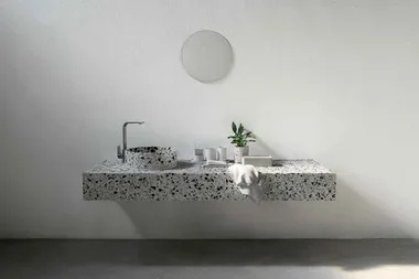
For longevity – important with a fixed finish such as tiling – steer clear of short-lived trends and aim for a simple design. In classic white, there are lots of subtle finishes and inviting shapes that give the monochrome look interest. “Marble is a timeless stone which will never date and it’s being used more broadly,” says Naomi Nimmo, referring to emerging colourways such as dusty pink and spearmint. Terrazzo’s return to glory shows no sign of abating, while our taste for metallic details is hitting tiling territory, with finishes from silver to rose gold adding glint and glamour. If you’re planning for the long haul, use metallics sparingly, as highlights rather than in swathes. Coloured grout has been having a moment, and can lift plain white tiles but, for a timeless look, match grout to tiles.
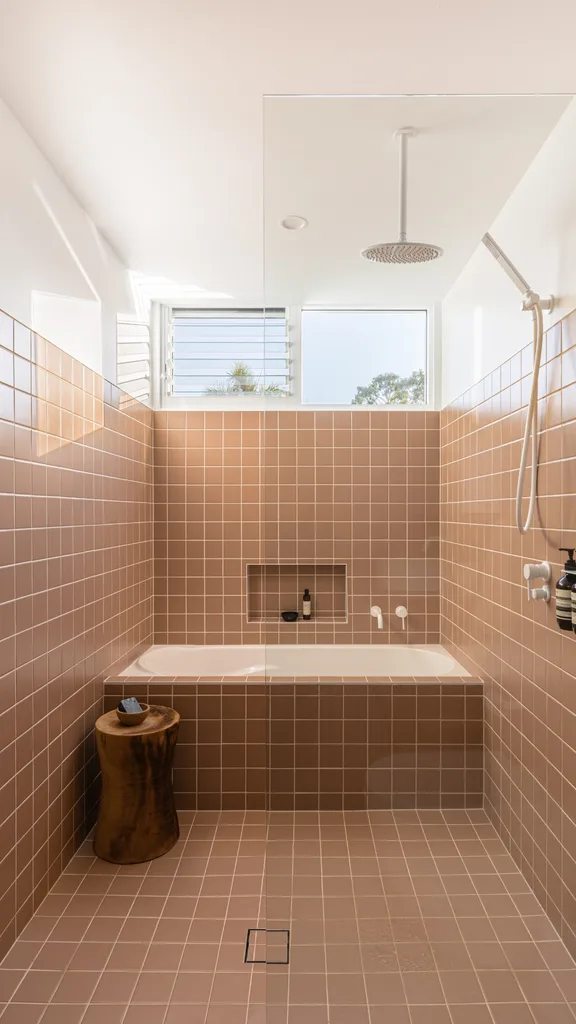
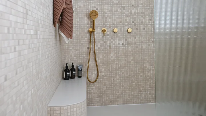 Image: Dream Home / Channel 7
