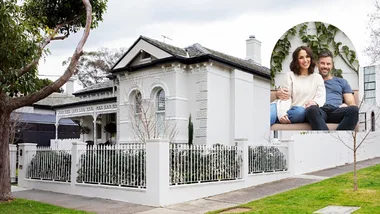
Dion and his wife Megan spent two years scouring Sydney’s Lower North Shore, trying to find the housing holy grail: the right home in the right area. They happened upon a cottage built in 1910 with a later, second-storey addition. It needed work, but it was located on a spacious corner block with the potential for lovely, leafy views. “We didn’t really want to renovate,” recalls Dion of the home they share with their daughters Fiona and Jennifer. “But we couldn’t find the combination that worked for us, so when we found this place, we thought we’d take the plunge.”
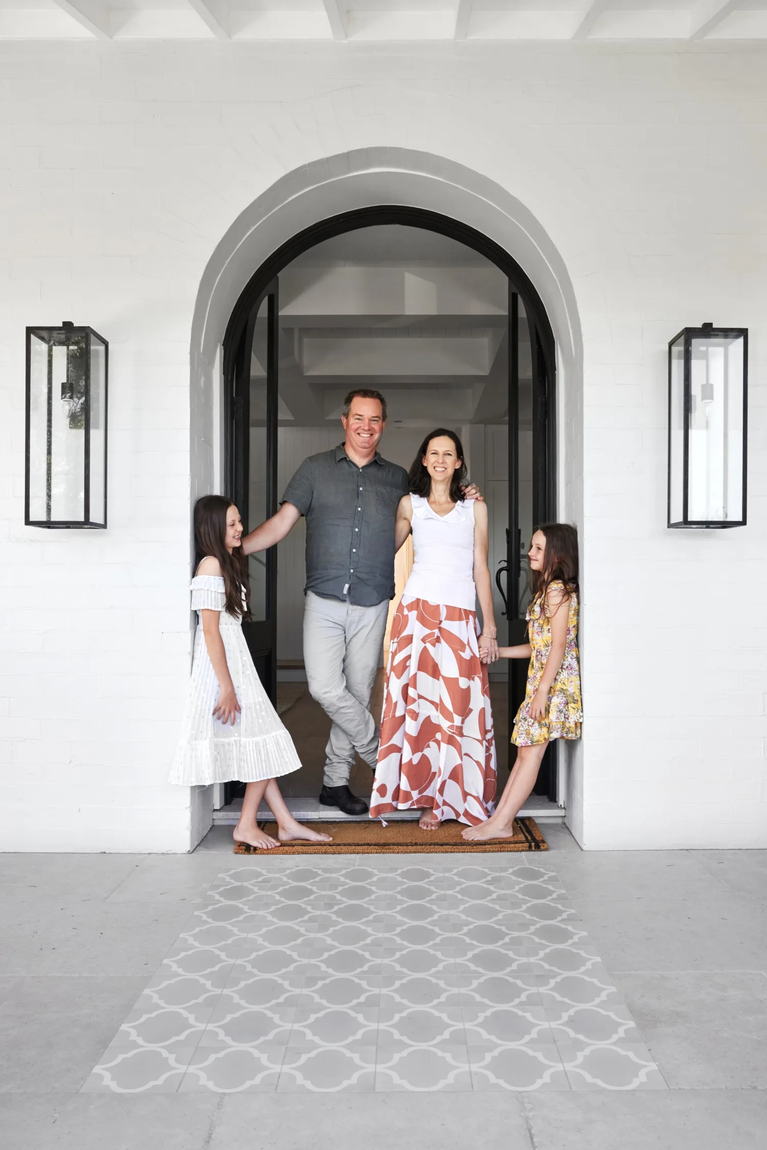
Who lives here? Dion, who runs an insurance company; his wife Megan, a partner in a law firm; and their daughters Fiona, eleven, and Jennifer, eight.
Best part of the renovation? Dion: “Probably the lounge-kitchen area where we spend the majority of our time. It’s a really appealing space, and it has a nice outlook. With nothing close to us, it feels quite open.”
Would you have done anything differently? “I asked my wife and kids that, and we couldn’t come up with anything! Alanna had a really incredible attention to detail.”
Is this your forever home? “Probably not – the house will probably see us through the kids’ schooling, so it’s more like a 10-year home! But it works pretty well now.”
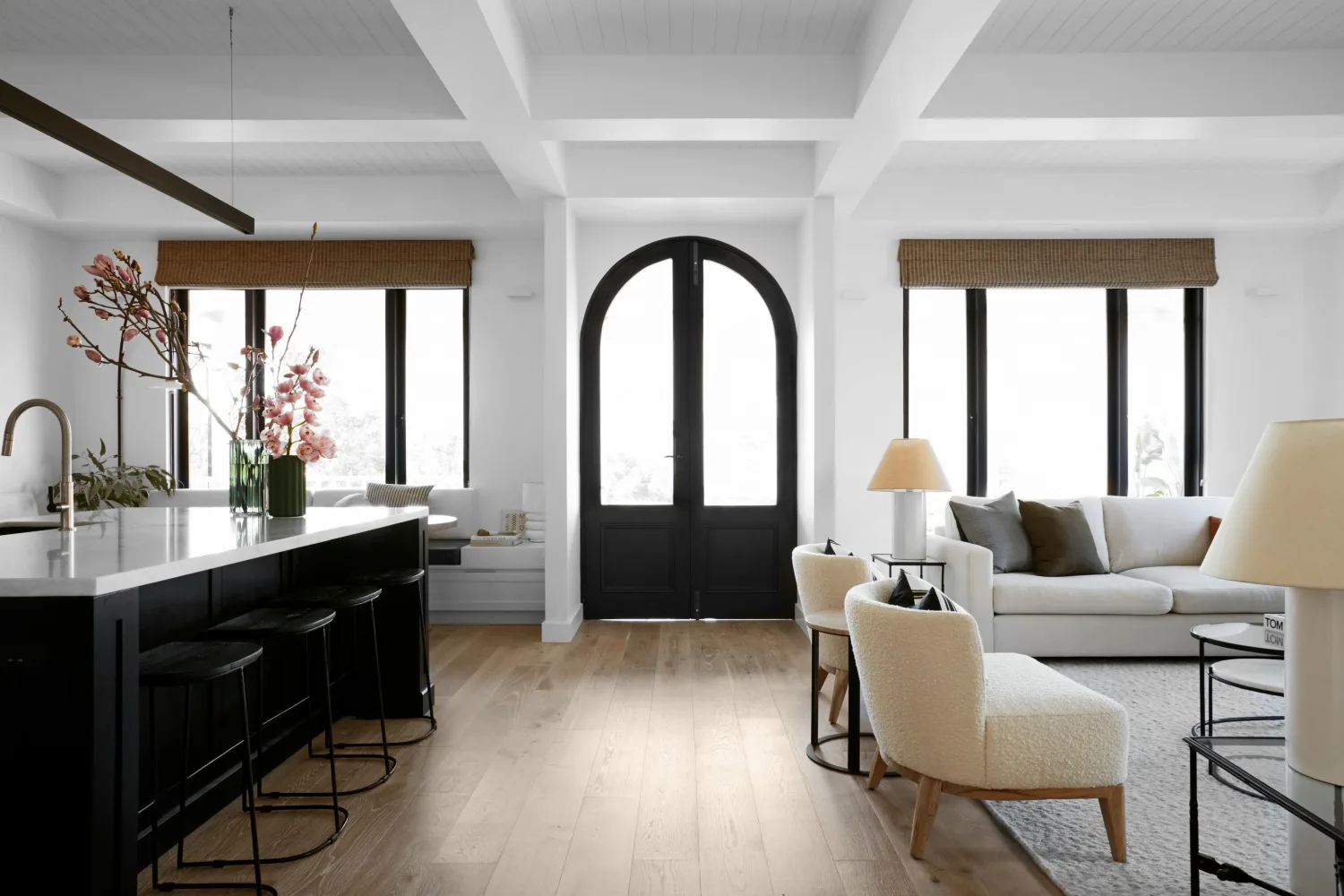
Aside from an interiors update, the biggest issue was the home’s layout. Most of the living areas, including the kitchen, were at the back of the property, which meant that the beautiful north-facing aspect at the front was more or less redundant. The decision was made to turn the home around, bringing the living areas up front and relocating the main bedroom and ensuite to the back. In the process, an awkwardly positioned staircase would be moved, and the upstairs level reworked to accommodate bedrooms and a rumpus.
“Lovely muted greys really help soften the hard, dramatic black and white of the other architectural features.”
Alanna Smit, interior architect
With two children and a busy working life, the couple handed the design and project management of the renovation over to interior architect Alanna Smit. “We liked the work Alanna had done before, but also when talking to her, she seemed to get what we were wanting to do in terms of design, and what it would look like,” says Dion. “The house was built in 1910, so we didn’t want ultra modern, but we did want to have something that was a little bit beachy, a little bit casual.”
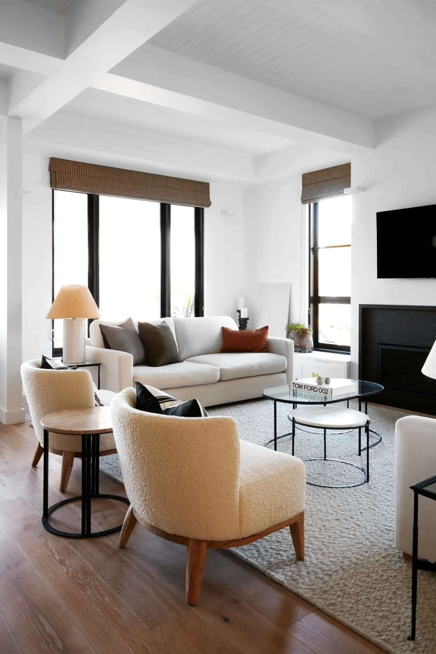
In the sitting room, a relaxed combination of three-seater ‘Steele Avenue’ sofas in Soho Chalk from Molmic, with curved armchairs from MCM House, brings the comfort, with an Armadillo rug underfoot delivering texture and cosiness. The nest of coffee tables, lamps and side tables are also from MCM House. The coffered ceiling, lined in V-groove panelling, cleverly disguises practicalities such as air conditioning outlets and support beams, with vertical steel posts hidden in the fireplace surround. “There’s a really nice symmetry to it all,” says Dion.
“It’s a great living space. The kids love it and we’re very happy.”
Dion, homeowner
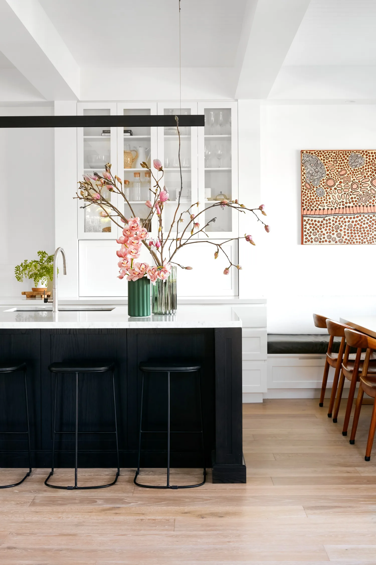
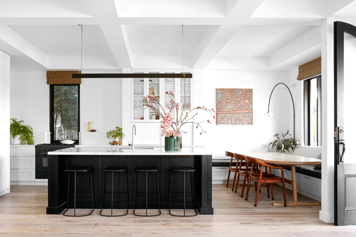
“When we spoke about how Dion and Megan like to entertain and congregate as a family, the idea of a separate dining room didn’t really come into play,” shares Alanna. “They would just never use it.” The family like to spend time in the laid-back dining area where they perch around the custom table by The Wood Room on ‘Peach’ chairs from Huski Studios or on the banquette seating. The statement artwork in the dining area is Ngamurru Dreaming by Yinarupa Nangala and the Valerie Objects ‘N3’ hanging light from Spence & Lyda is a subtle nod to the arched features elsewhere in the home.
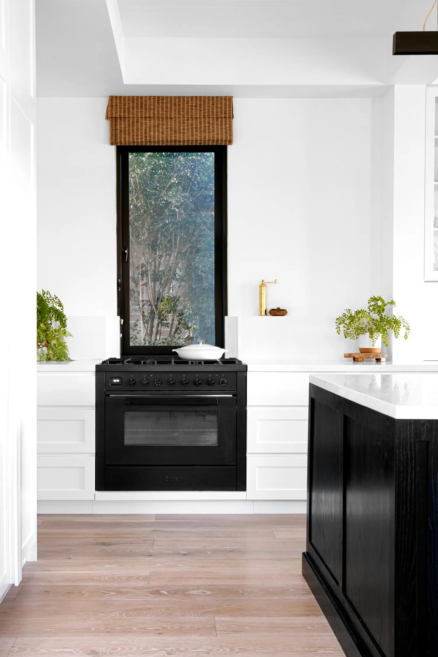
A simple monochrome scheme defines the kitchen and dining zone, designed by Alanna and built by Northern Kitchens and Joinery. “We used a traditional Shaker profile but kept it a little bit cleaner and less fussy by putting in a handleless detail and integrating some of the appliances like the fridge and freezer,” says Alanna. The dining zone has more storage in the banquette seating.
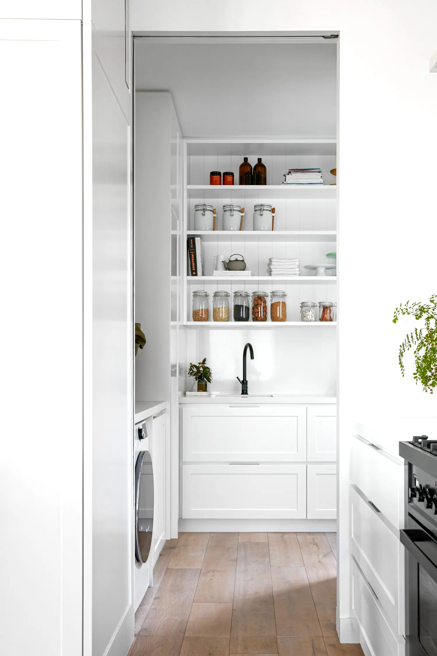
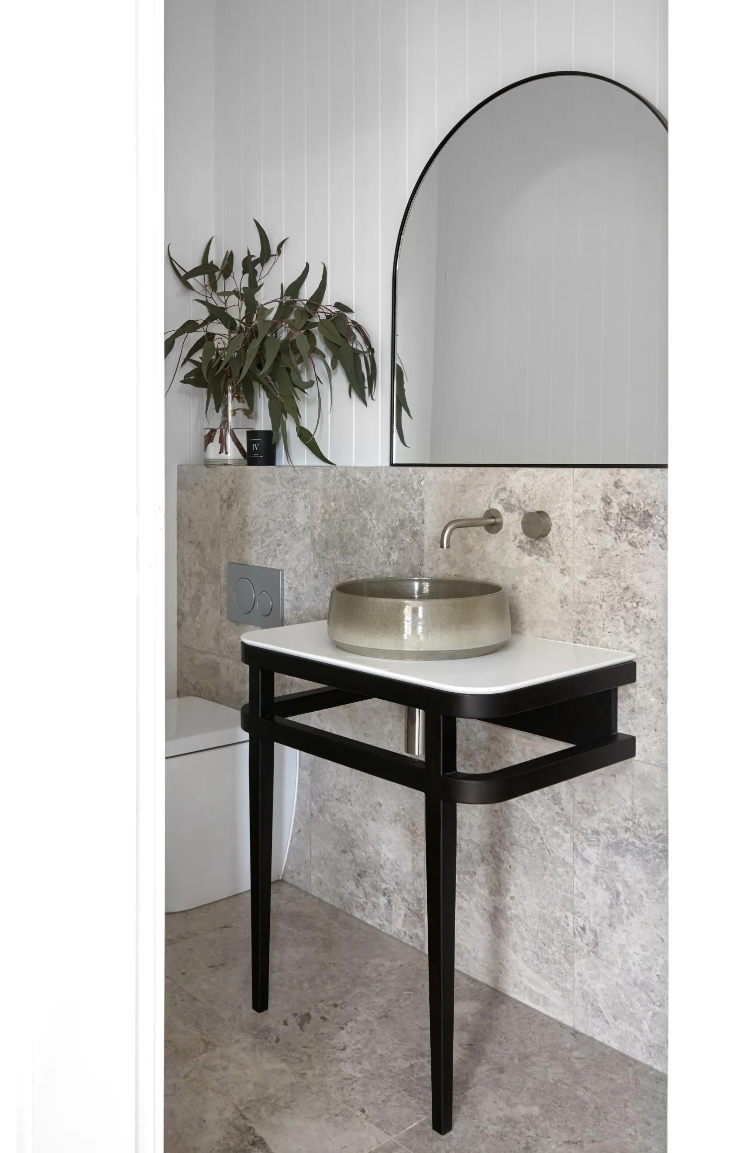
Beyond the kitchen, the laundry and pantry form part of a functional hub that encompasses the ensuite and powder room. “They are all piggy-backed together as a bit of a space saver, allowing the rest of the house to have the nicer aspects of direction, light and scenery,” says Alanna. This zone, fitted out in the same cabinetry as the main part of the kitchen, includes a Gareth Ashton ‘Lucia’ kitchen mixer from Abey.
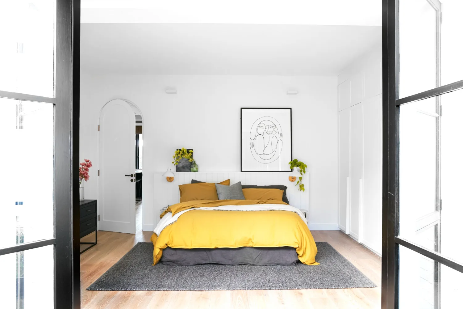
With the design and colour palette agreed, Alanna, who worked with builders Bluestone Homes, rearranged the ground floor layout and knocked down interior walls to create a wonderful, open-plan living space that now takes full advantage of the home’s open views.
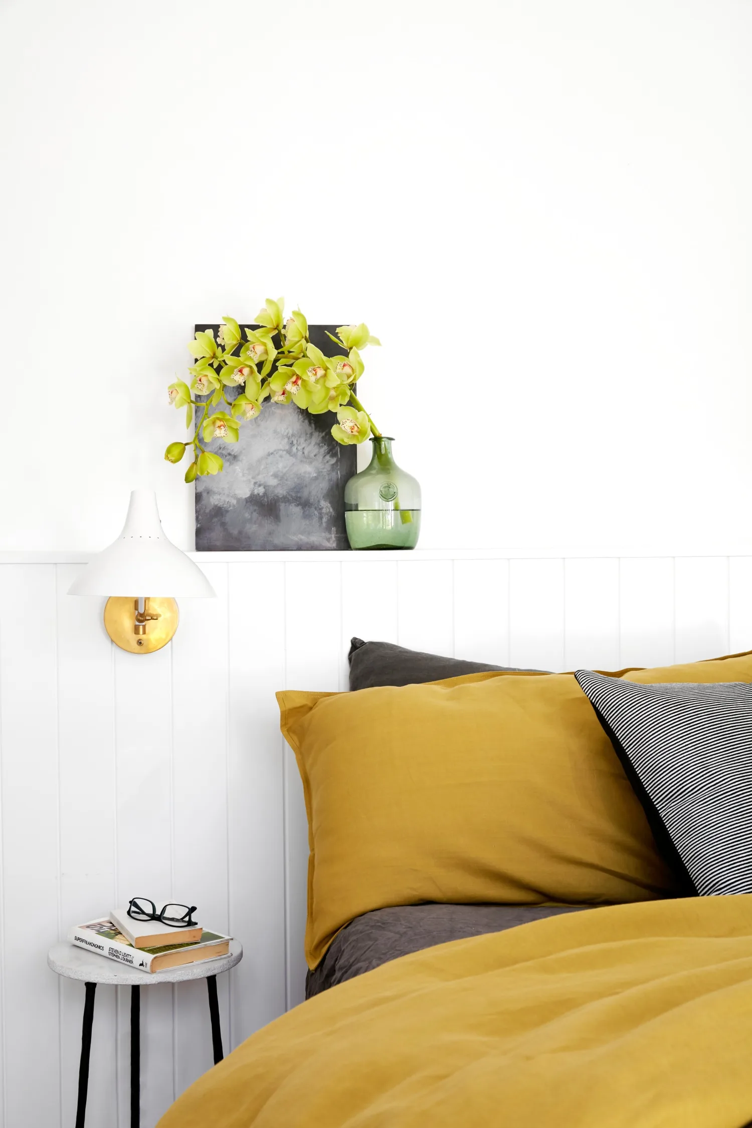
Within the simple colour scheme, Alanna had the opportunity to lift the style quotient with considered detailing. A coffered ceiling, V-groove finishes and black-framed windows all contribute.
The family has now been in the home for just over two years and love their new living space. “Renovating allowed us to get some of the things that we specifically wanted,” says Dion. “Every now and then we still find things where Alanna’s thought through the detail of how a cupboard opens and turns, and the light switch is accessible – the kind of details we would never have thought of. The design’s really good, but the practical detail of where to put a plug and powerpoint – to have it right just makes it so much easier to live in.”
Shaker-style doors and V-groove panelling on the built-in wardrobe in the main bedroom, painted Dulux Lexicon Quarter, speak to the home’s origins, with splashes of colour provided by bedlinen from In The Sac. “There wasn’t room for a separate walk-in robe, but it really wasn’t a requirement,” says Alanna. “But having the wardrobe in the bedroom, I wanted to keep it as beautiful as possible.” An Armadillo ‘Desert’ rug in Carbon lines the floor.
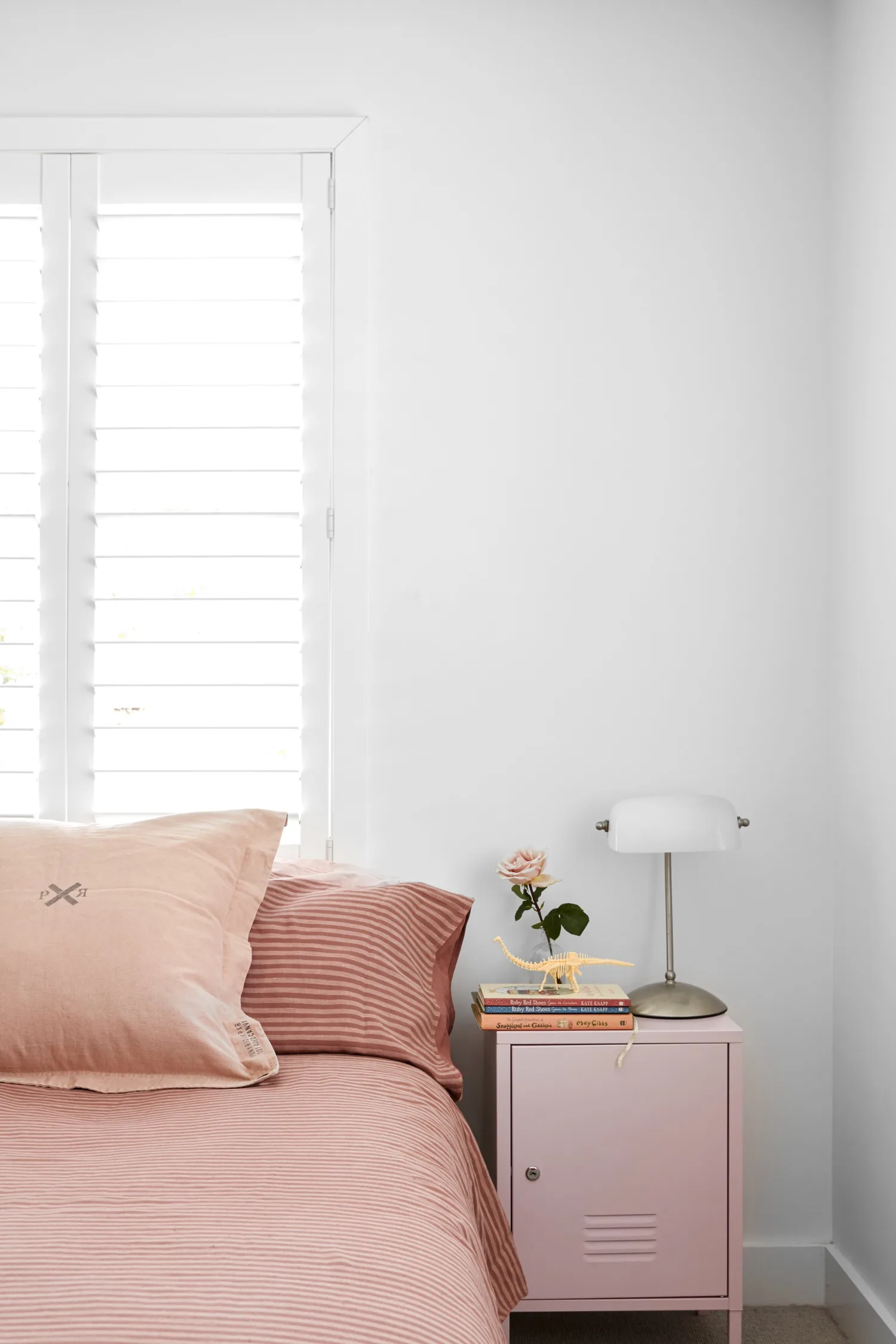
In Jennifer’s room, the neutral palette seen throughout continues, with colour provided by In The Sac bedlinen and a bedside locker from Kmart.
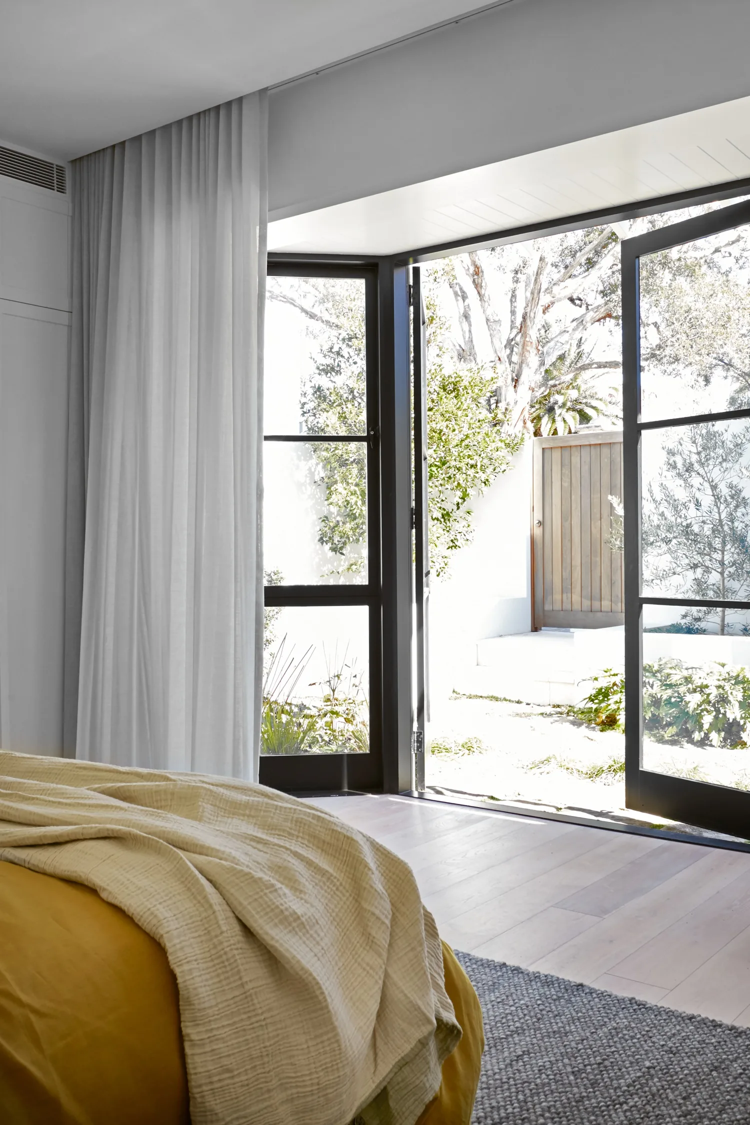
The main bedroom and ensuite next door were relocated to the back of the home where the rooms now open onto a pretty little courtyard and garden space, that was revived by Darren Cowley of DC Landscapes. Flowing curtains by Inside & Out Living add to the easy, breezy style of the bedroom.
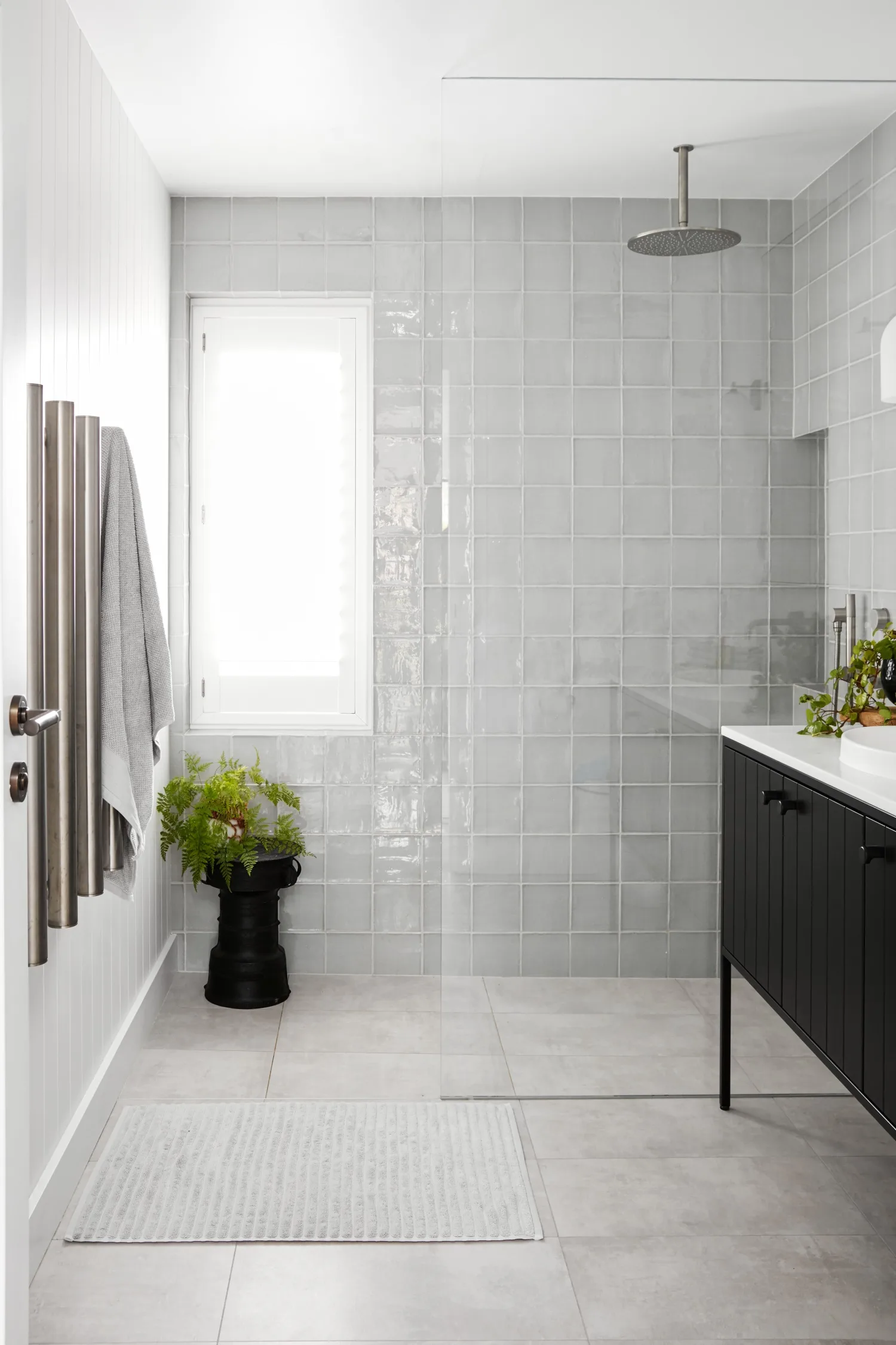
The girls’ shower room has a timeless feel that will easily carry them through their teenage years. The ‘Ivy’ 1200 vanity in Matte Black is from Architectural Design Products. Square tiles in Aqua by Tiles By Kate are a soft touch in the girls’ bathroom.
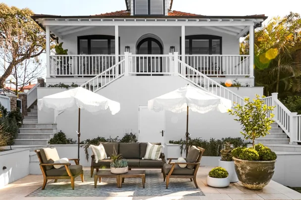
“It’s a beautiful aspect with all the greenery around here, and it’s really quite private,” says Alanna. Dulux Colorbond Night Sky on the door and windows provides a rich counterpoint to a fresh palette of Dulux Terrace White walls, and Dulux Lexicon Quarter on the balustrade, posts and trim.
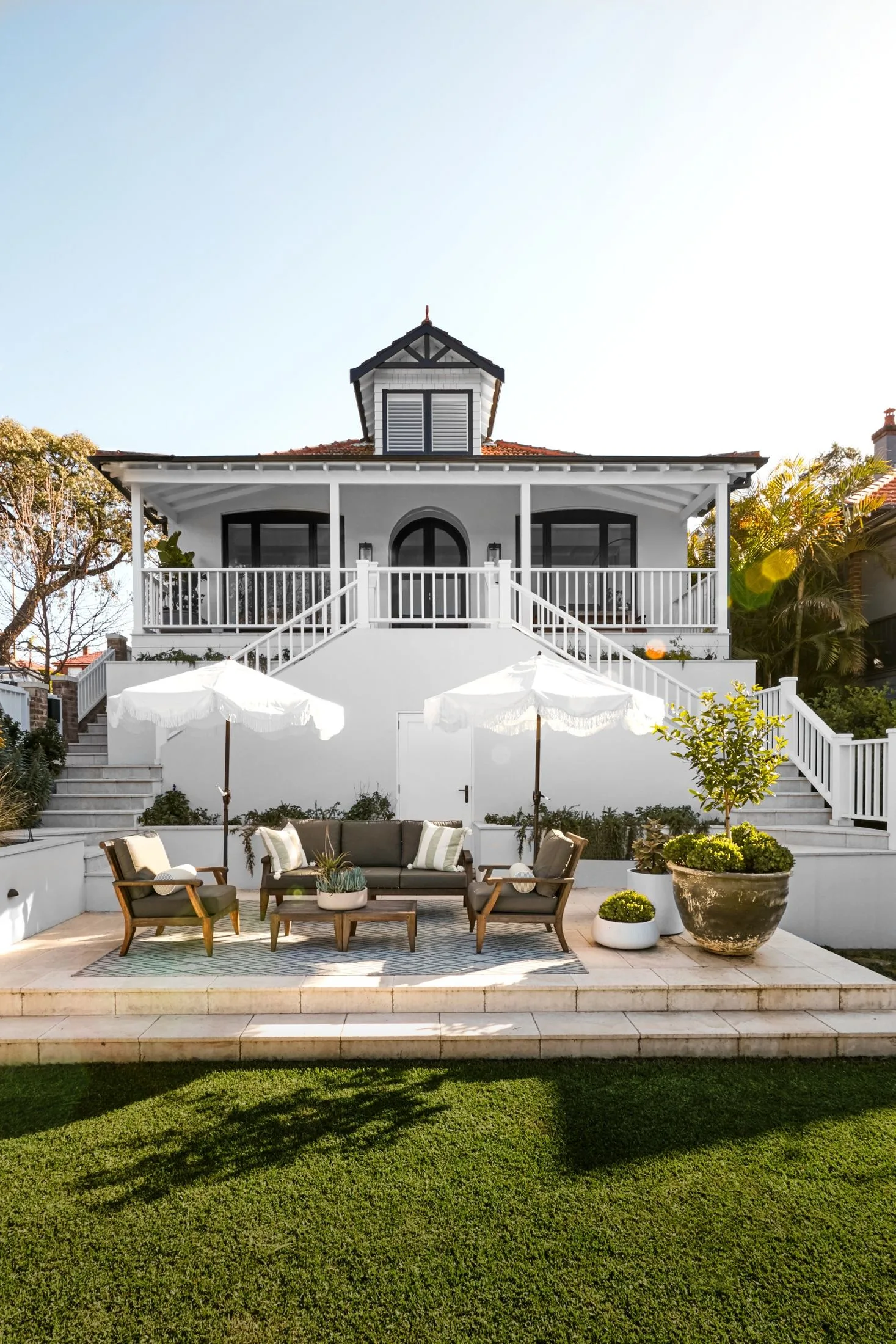
In the backyard, a re-levelled patio hosts an entertaining zone, with a ‘Juliet’ outdoor setting from Woodbury Furniture and shade umbrellas from California Umbrella.
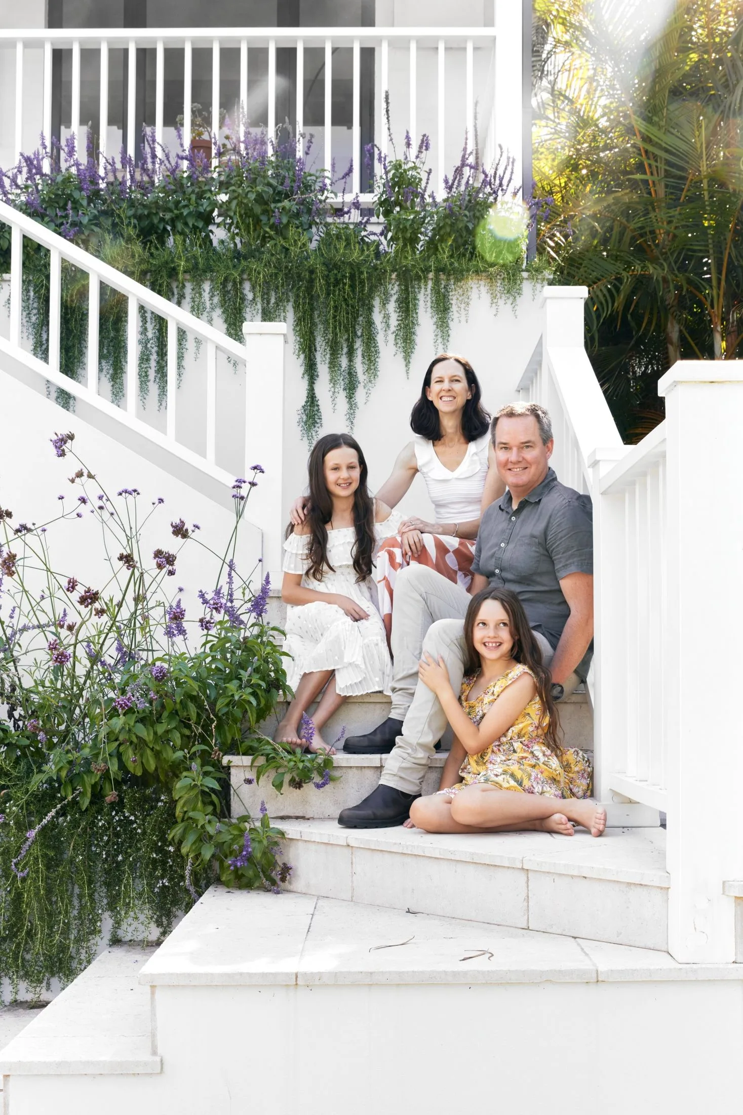
“Everything is very well thought through, and there’s nothing much that we would change.”
Dion
Source book
Design: Alanna Smit Structural Interiors, @alannasmitdesigns, alannasmit.com.au.
Builder: Neil Jones, Bluestone Homes, (02) 9979 7523, bluestonehomes.com.au.
Kitchen company: Northern Kitchens and Joinery, (02) 9999 6194, northernkitchens.com.au.
Joinery: Shamrock Joinery, (02) 4388 5515, shamrockjoinery.com.au.
Landscaping: Darren Cowley, DC Landscapes, @dclandscapesptyltd.
 Photography: Jacqui Turk / Styling: Alanna Smit

