We’re loving the design work shining through from the House Rules teams each week as they renovate each other’s homes. Innovations in interior design, layout, storage and styling are hitting new House Rules highs and there are plenty of ideas to steal from these whole home renovations.
We’ve pulled together our favourite 11 design ideas so far this season and show you why they work so well.
1. VJ boards as bedheads
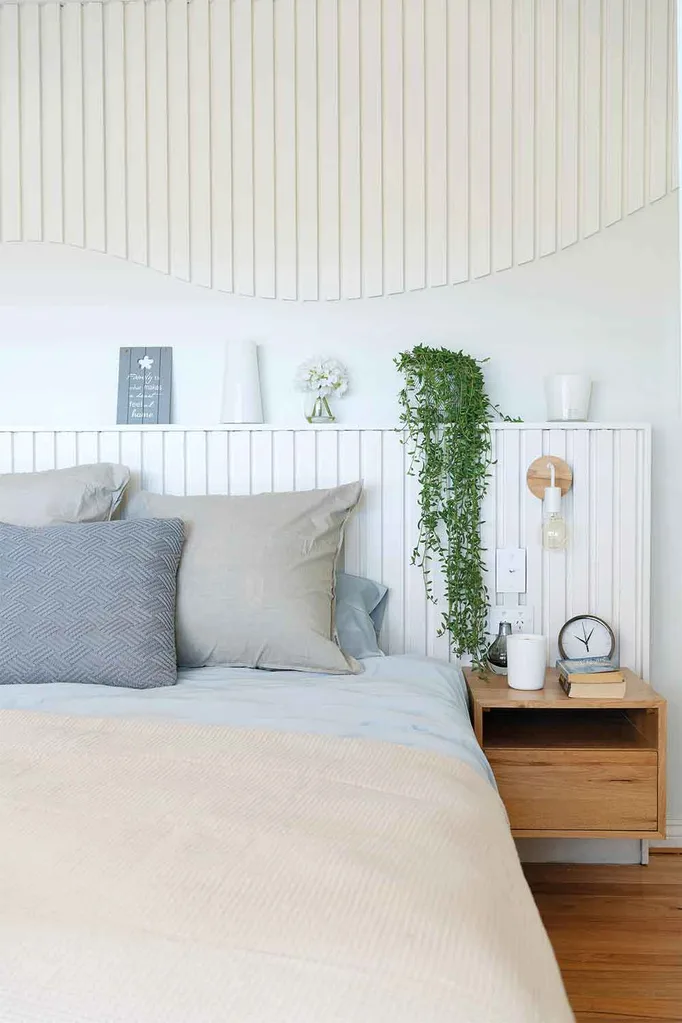
Simple, stylish and affordable, this is a genius execution to lift to any master bedroom from ordinary to extraordinary. The ledge it creates above the bed is perfect for styling or storage and, just like an upholstered bedhead, painted boards can be updated with a new coat of paint any time to give it a refresh, or a whole new colour scheme.
2. Outdoor dining table inside the house
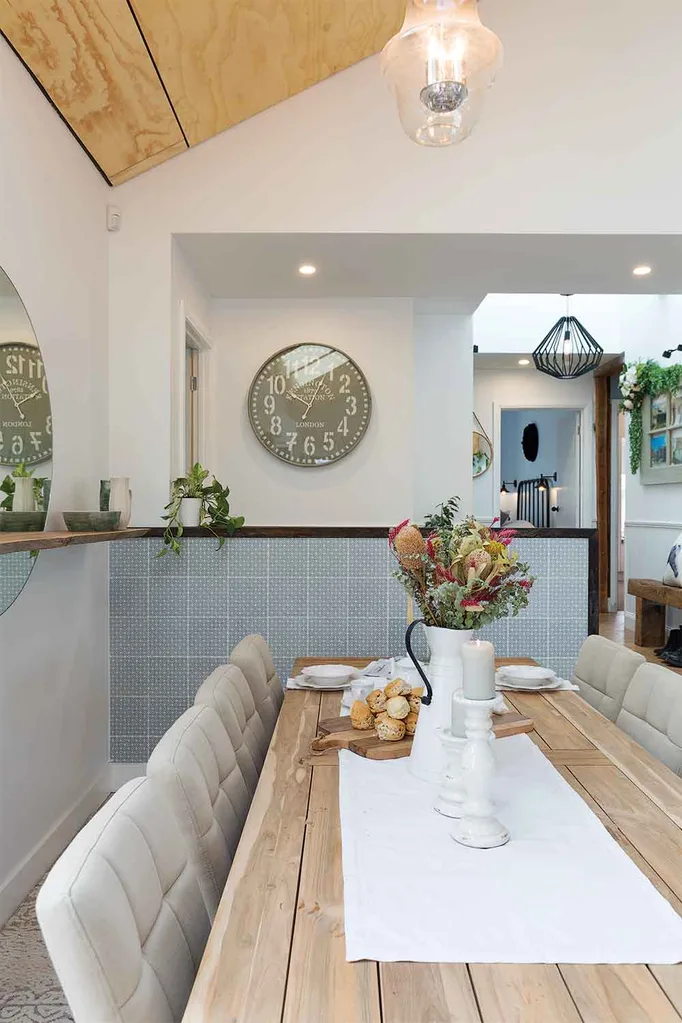
We’ve often suggested taking indoor furniture outside to create an outdoor room, but flipping this concept can work beautifully too. Looking to create a rustic, textured effect when choosing the furnishings for Katie & Alex’s dining room, Mikaela & Eliza chose to bring an outdoor timber dining table inside, which impressed judge Jamie Durie.
3. Tiled fireplace
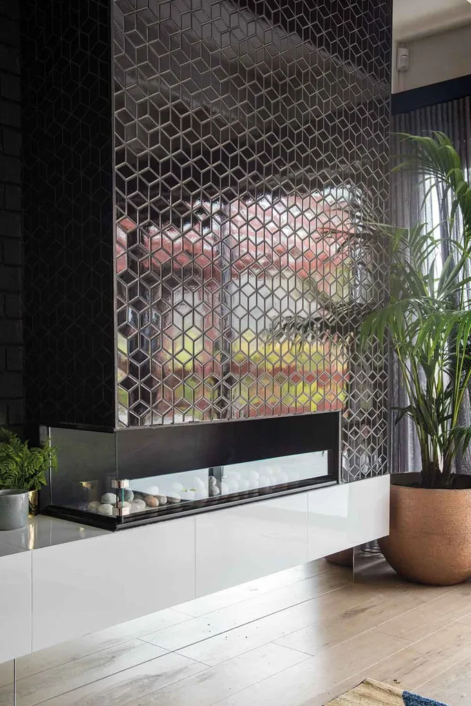
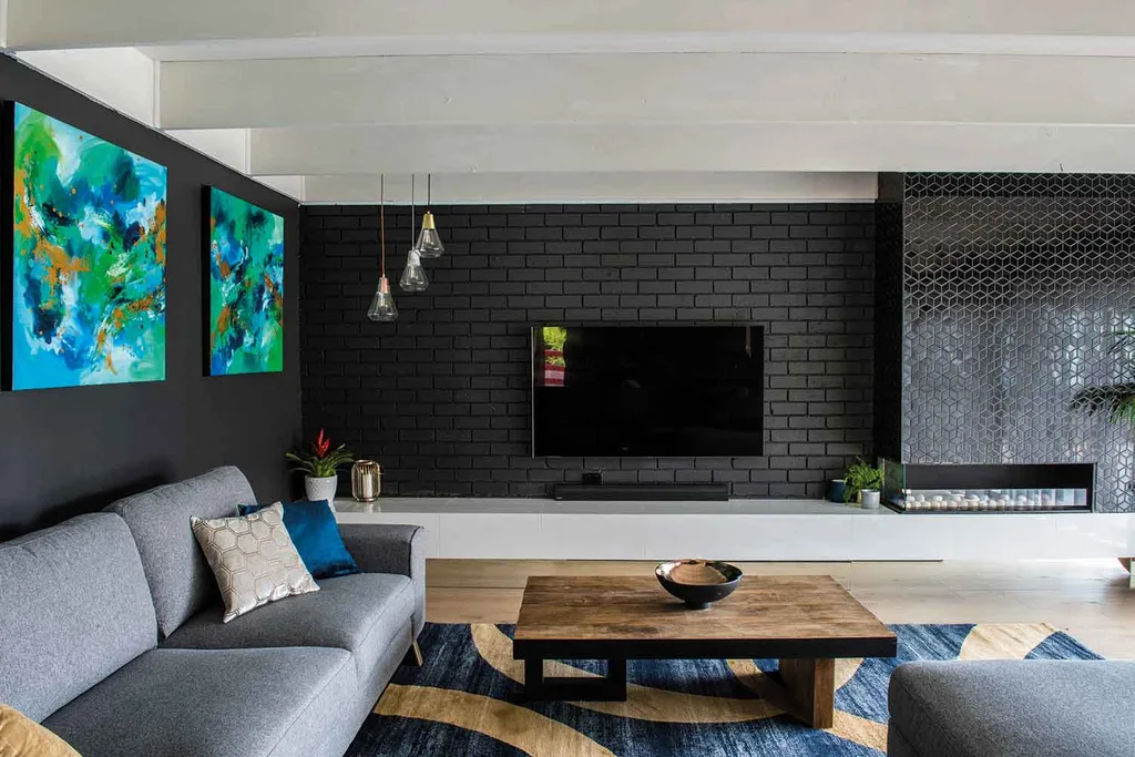
Early in the series Mikaela & Eliza hit a decorating high note with their lounge room for Pete & Courtney. The judges loved the contemporary decorating treatment they used to work with, rather than against the existing brick wall. The inspired addition of a black glossy geometric tile on the chimney breast above the fireplace added subtle texture and sophistication.
4. Timber detailing on bedroom wall
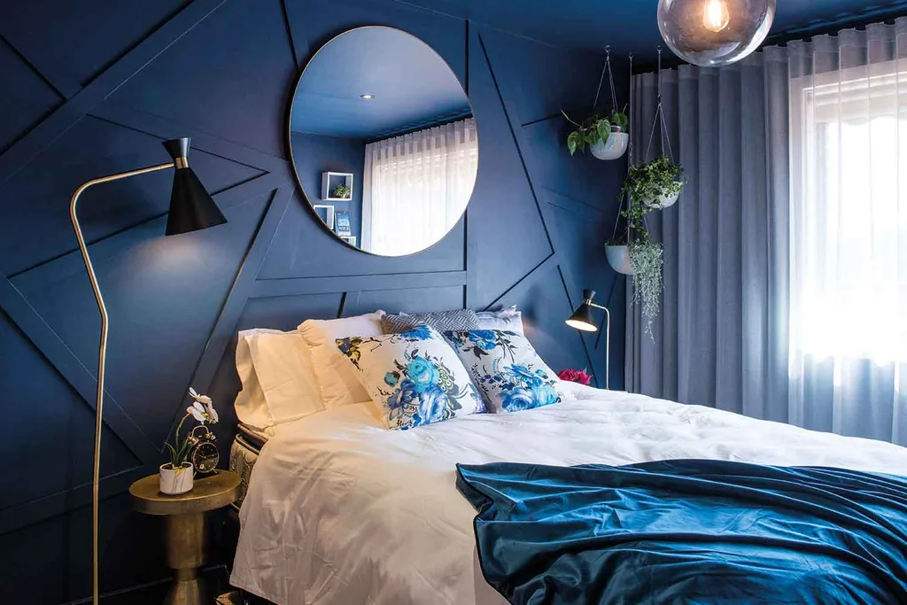
With a House Rule of “Give us more than the obvious,” Tim & Mat literally nailed the brief in Pete & Courtney’s guest bedroom with their wall decoration. Sticking to a single paint colour on the wall, they added interest by using narrow strips of timber pieced together at random geometric angles. Perhaps this is a House Rule we should all take on board when decorating?
5. Round mirror behind shelf
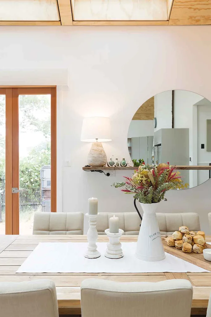
Mirrors work wonders to open up a space and reflect light around the room. In their dining room design for Katie & Alex’s 21st Century country house they managed to make a rustic shelf look contemporary by layering it in front of an oversized round mirror, whilst allowing ample room to style vignettes on the shelf.
6. Window seats
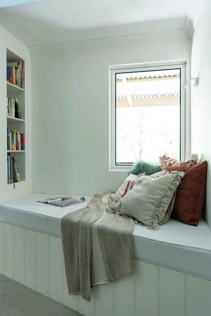
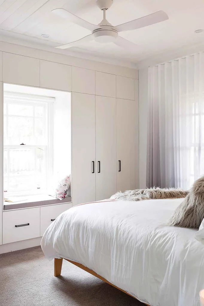
Window seats are popping up everywhere this season on House Rules and for good reason – they’re the perfect solution to resolve a space created by built-in storage, often around an architectural feature, such as a fireplace or built-in wardrobes. All it takes is the addition of a comfy upholstered cushion on the bench seat and a fabulous stack of cushions to up the ante for both colour and comfort!
7. Simple mud room
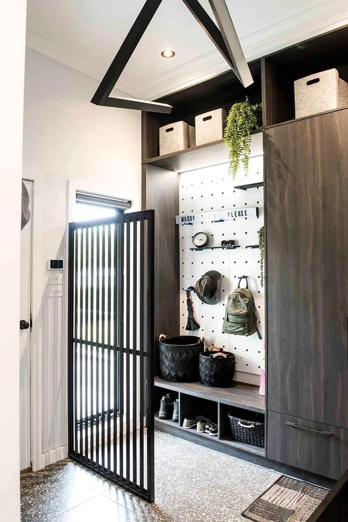
Mud rooms are one of the biggest trends this year in homes and are a brilliant solution for functional and stylish storage. In Tim & Mat’s home Shayn & Carly created a clever mud room design using flatpack wardrobe modules and a fun peg board backing to allow for the open storage of hats and bags.
8. Wrap-around shower niche
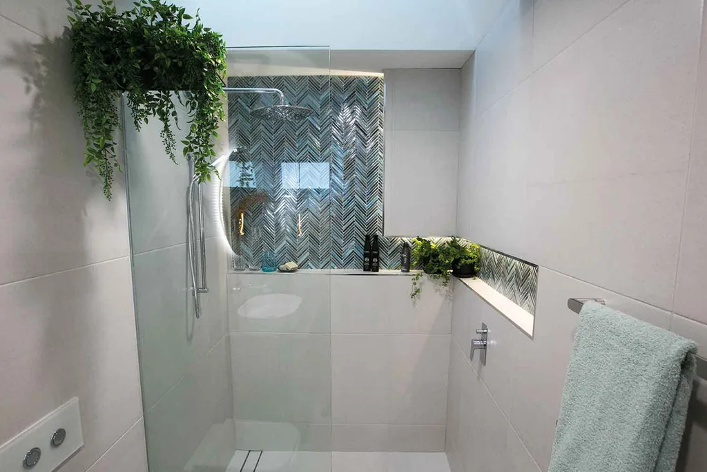
Shower niches are another big trend in bathrooms right now and in their ensuite design for Shayn & Carly, Mikaela and Eliza added an extra dimension to the small shower recess by taking the inset tiles right up to the ceiling in the shower shelf. They cleverly wrapped the niche around to the adjacent wall to continue the decorative effect and double the shelf space. With the addition of LED strip lighting, the feature tiles make a show-stopping statement of colour and texture.
9. Wallpaper in the laundry
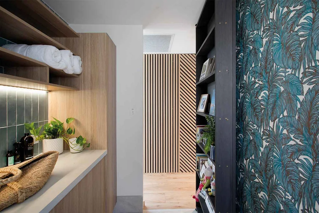
A controversial choice by Katie & Alex, we think including a bold wallpaper feature in Shayn & Carly’s laundry is a masterstroke. Strong decoration in spaces that are usually neglected for their more functional roles, like powder rooms laundries are fast becoming the perfect space to spread your design wings.
10. Creating zones within a space
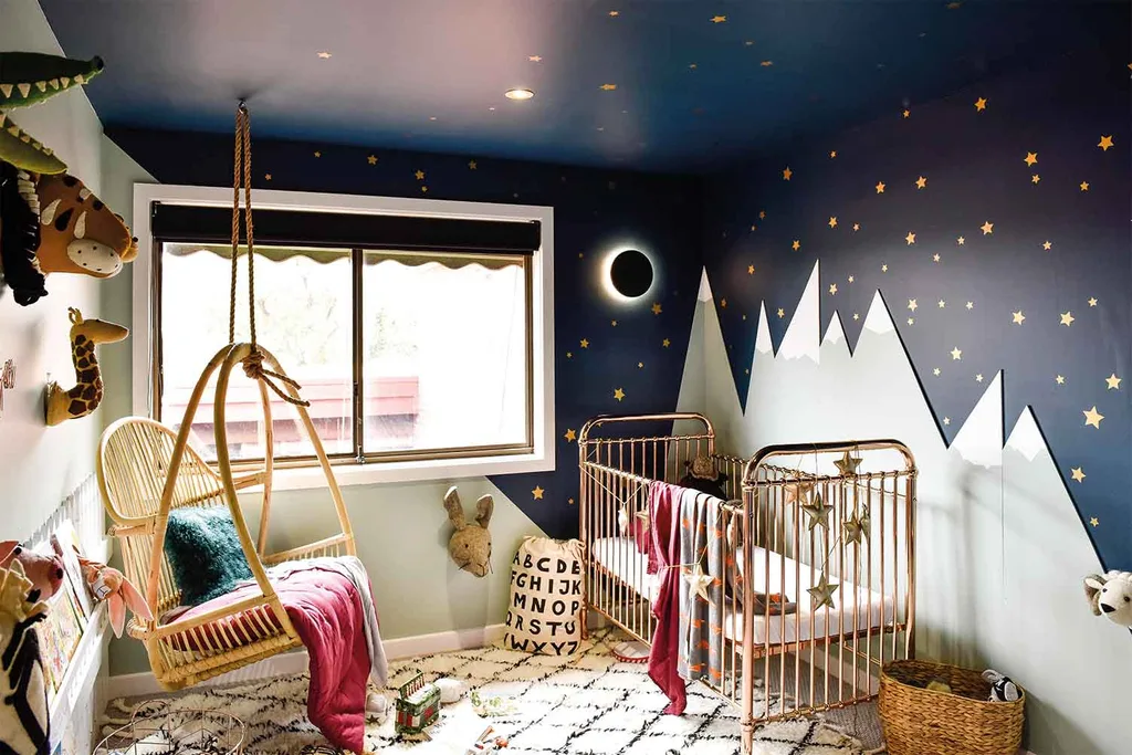
In Pete & Courtney’s home renovation baby Casper’s room needed to take things to the next level in decorating and dividing the room into two zones – for sleep and play- was a smart and simple idea by Katie & Alex.
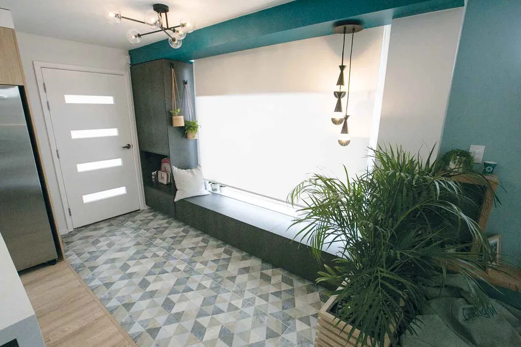
Tim & Mat demarcated the entry zone in Shayn & Carly’s home by tiling the floor area of the entrance right up to the front door.
11. Feature ceiling
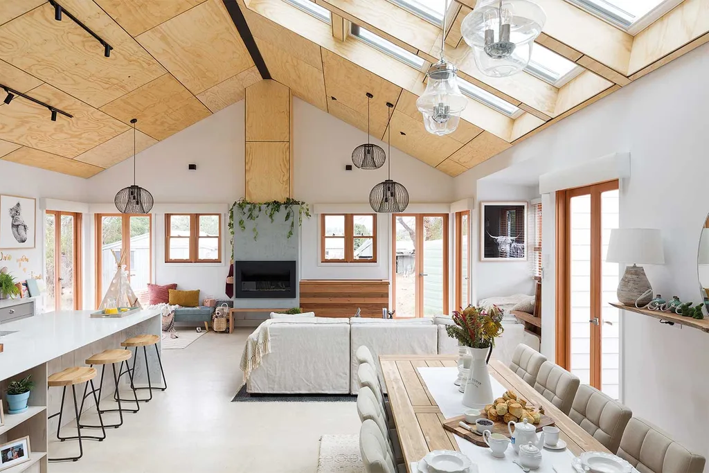
In Katie & Alex’s country cottage Tim & Mat elevated the entire open plan living area with their brilliant execution of the timber ply-lined ceiling. Installing a bank of skylights instead of the usual single one serves both to maximise natural light and draw the eye upwards.
You might also like:
House Rules reveal: Katie & Alex’s crumbling cottage transformation
House Rules reveal: Tim & Mat’s Victorian cottage renovation
The best laundries of House Rules
